Redesigning Rocket's mortgage calculator experience
Redesigning Rocket's mortgage calculator experience
Rocket's mortgage calculator was performing very poorly in the SEO rankings on Google and the team wanted to do an overhaul by enhancing the UX.
My work: Find out how to bridge the gap between what is lacking in the existing calculator experience and how to give the users something they will love. I did UX research, Usability Testing and all the initial and final design screens
My role
My role
Product Designer
Product Designer
Project
Project
Internship Project
Internship Project
Timeline
2 months (May - July 2025)
Tools used
Figma, Figma Make
Problem
Problem
The mortgage calculator had a low engagement rate and was very low on the Google SEO rankings relative to Rocket's competitors
The mortgage calculator had a low engagement rate and was very low on the Google SEO rankings relative to Rocket's competitors
Ideal solution
Ideal solution
Find out the issues and gaps, then enhance the user experience of the mortgage calculator and improve SEO rankings
Find out the issues and gaps, then enhance the user experience of the mortgage calculator and improve SEO rankings
TLDR - Swipe between Old and New designs
TLDR - Swipe between Old and New designs


Our Calculator was buried deep in Google search
Our Calculator was buried deep in Google search
If you googled "mortgage calculator", Rocket's link was buried deep on the 6th page of google search results — basically a graveyard.
If you googled "mortgage calculator", Rocket's link was buried deep on the 6th page of google search results — basically a graveyard.

Diagnosing the problem
Diagnosing the problem
We found out that this was both a Tech and UX problem. So while the developers optimized the keywords for SEO, I partnered with Melissa Beaver to conduct a user study.
We found out that this was both a Tech and UX problem. So while the developers optimized the keywords for SEO, I partnered with Melissa Beaver to conduct a user study.

Tech issues
Tech issues
Discovered that many keywords weren’t crawlable by Google.
Low engagement as a result of SEO rankings
The new content needed clear organization and structure before implementation.
Discovered that many keywords weren’t crawlable by Google.
Low engagement as a result of SEO rankings
The new content needed clear organization and structure before implementation.
UX issues
UX issues
I partnered with the UX Research team to run usability tests.
Identified key issues users were facing.
Uncovered user needs and expectations.
Pinpointed gaps in the current experience.
I partnered with the UX Research team to run usability tests.
Identified key issues users were facing.
Uncovered user needs and expectations.
Pinpointed gaps in the current experience.
Usability testing
Usability testing
It became clear that the challenge was both technical and UX-related. While developers optimized the keywords for SEO, I collaborated with UX Research to conduct a user study.
It became clear that the challenge was both technical and UX-related. While developers optimized the keywords for SEO, I collaborated with UX Research to conduct a user study.

Tasks performed by users
Task 1
Task 1
Find the mortgage calculator
Find the mortgage calculator
40% of users mistook the Affordability Calculator for the Mortgage calculator
40% of users mistook the Affordability Calculator for the Mortgage calculator
Task 2
Task 2
Fill in the details for calculation
Fill in the details for calculation
Over 30% people took over 2 minutes to fill the form and said they would not spend that much time
Over 30% people took over 2 minutes to fill the form and said they would not spend that much time
Task 3
Task 3
Add a lump-sum option alongside the down payment.
Add a lump-sum option alongside the down payment.
Users reported that it was confusing and difficult to predict how much they could pay as a lump-sum amount.
Users reported that it was confusing and difficult to predict how much they could pay as a lump-sum amount.
Test Insights
Test Insights

Usability Testing insights
Usability Testing insights
Users found key tasks like completing all input fields difficult to locate due to poor visibility and guidance.
Users recommended better button placement, clearer naming, larger fonts, and improved text hierarchy for easier navigation and readability.
Users found key tasks like completing all input fields difficult to locate due to poor visibility and guidance.
Users recommended better button placement, clearer naming, larger fonts, and improved text hierarchy for easier navigation and readability.
Users found key tasks like completing all input fields difficult to locate due to poor visibility and guidance.
Users recommended better button placement, clearer naming, larger fonts, and improved text hierarchy for easier navigation and readability.

5
5
Number of users
Number of users
Number of users

55%
55%
Task completion rate
Task completion rate
Task completion rate

1 min 12 secs
1 min 12 secs
Average time per task
Average time per task
Average time per task

69.7
69.7
Average SUS
Average SUS
Average SUS
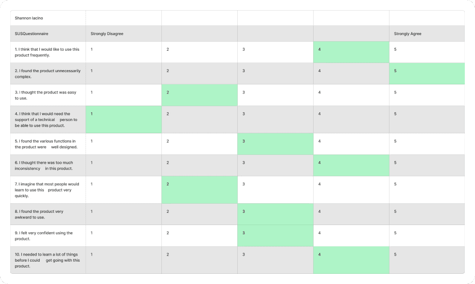
System Usability Scale Testing
System Usability Scale Testing
After the tasks, I asked the participants questions to determine the SUS score of 69.7
After the tasks, I asked the participants questions to determine the SUS score of 69.7
Major findings and insights
Major findings and insights

The users also gave us some suggestions during the interviews:
The users also gave us some suggestions during the interviews:

Navigation Pain Points
Navigation Pain Points
Users found it hard to scan through all the text fields as there was no hierarchy
The absence of breadcrumbs caused confusion to users in terms of navigation
This calculator was titled "Mortgage affordability calculator" and we had a separate "Affordability calculator" which confused users
Users found it hard to scan through all the text fields as there was no hierarchy
The absence of breadcrumbs caused confusion to users in terms of navigation
This calculator was titled "Mortgage affordability calculator" and we had a separate "Affordability calculator" which confused users

Usability Pain Points
Usability Pain Points
Users became overwhelmed with the amount of information they were provided with.
There was no mention of which input fields were necessary or not, which resulted in users skipping and not being able to progress.
The platform did not meet accessibility standards(WCAG)
The CTA was not working
Users became overwhelmed with the amount of information they were provided with.
There was no mention of which input fields were necessary or not, which resulted in users skipping and not being able to progress.
The platform did not meet accessibility standards(WCAG)
The CTA was not working
User recommendations
User recommendations
Users wanted to see rates based on their location as rates differ greatly between places
They wanted more control to enter specific data like HOA and PMI.
Users wanted to see rates based on their location as rates differ greatly between places
They wanted more control to enter specific data like HOA and PMI.
4/5
4/5
(Average)
(Average)
"I found filling in details difficult to do"
"I found filling in details difficult to do"
1 - not difficult at all. 5 - very awkward
1 - not difficult at all. 5 - very awkward
Solution ideation — Prioritizing data points
Solution ideation — Prioritizing data points
Important information points from user interviews and web analytics were analyzed and categorized into three buckets — Crucial, Optional, and Not Needed. This framework clarified which inputs should be requested from users and highlighted gaps in the existing calculator.
Important information points from user interviews and web analytics were analyzed and categorized into three buckets — Crucial, Optional, and Not Needed. This framework clarified which inputs should be requested from users and highlighted gaps in the existing calculator.
Crucial
Crucial
Home Price
Down Payment
Loan term
Interest rate
ZIP Code
Home Price
Down Payment
Loan term
Interest rate
ZIP Code
These data points were essential for the calculation, and ZIP code was added based on user feedback.
These data points were essential for the calculation, and ZIP code was added based on user feedback.
Not needed
Not needed
Lumpsum amount
Lumpsum amount frequency
Type of mortgage
Lumpsum amount
Lumpsum amount frequency
Type of mortgage
Most users struggled to predict how much they could contribute as a lump-sum amount.
Most users struggled to predict how much they could contribute as a lump-sum amount.
Optional
Optional
Home Owner's Insurance
Private Mortgage Insurance
Yearly Property taxes
Home Owner's Insurance
Private Mortgage Insurance
Yearly Property taxes
Many users don’t have this information at this stage, but including it would improve result accuracy.
Many users don’t have this information at this stage, but including it would improve result accuracy.
A lot of users don't know this information during this stage of the buying process, but it would lead to better result accuracy.
How might we redesign the mortgage calculator experience to make it easier for the user?
How might we redesign the mortgage calculator experience to make it easier for the user?
The UI was redesigned following R4, Rocket’s new design system.
The UI was redesigned following R4, Rocket’s new design system.
Include only the crucial and optional data points as input fields
Include only the crucial and optional data points as input fields
Design system
Design system
The redesign of the calculator was as part of a company-wide effort to update all the UI with the new R4 design system.
The redesign of the calculator was as part of a company-wide effort to update all the UI with the new R4 design system.
FINAL DESIGN
FINAL DESIGN
Renaming different calculators
Renaming different calculators
Users confused the “Mortgage Affordability Calculator” with a generic “Affordability Calculator,” so the tool was renamed to “Mortgage Calculator” for clarity.
Users confused the “Mortgage Affordability Calculator” with a generic “Affordability Calculator,” so the tool was renamed to “Mortgage Calculator” for clarity.
Breadcrumbs
Breadcrumbs
A breadcrumb menu was added to enhance navigation and help users track their progress.
A breadcrumb menu was added to enhance navigation and help users track their progress.
We added in breadcrumb navigation to improve navigation
New card layout
New card layout
Going with the theme of the design system, we spilt the input fields and the results into two separate cards. This creates a clear distinction and better readability
Going with the theme of the design system, we spilt the input fields and the results into two separate cards. This creates a clear distinction and better readability
Sticky scroll
Sticky scroll
Added a sticky scroll side menu so users can keep a track of where they are on the page and jump to topics quickly
Added a sticky scroll side menu so users can keep a track of where they are on the page and jump to topics quickly
RESULTS
RESULTS
Made it on the first page of search results
Made it on the first page of search results
For google search results titled "mortgage calculator", Rocket's calculator featured in the first page of results consistantly over
For google search results titled "mortgage calculator", Rocket's calculator featured in the first page of results consistantly over

Second round of User testing
Second round of User testing
During the second round of testing, participants validated the new design and responded with positive feedback.
During the second round of testing, participants validated the new design and responded with positive feedback.
4/5 👉 1/5
4/5 👉 1/5
(Avg. Difficulty ratings)
(Avg. Difficulty ratings)
"I found it very easy and straightforward "
"I found it very easy and straightforward "
1 - not difficult at all. 5 - very awkward
1 - not difficult at all. 5 - very awkward
55% 👉 90%
55% 👉 90%
Task Success rate
Task Success rate
Key takeaways
Key takeaways
I learnt so much over the summer working with an amazing set of Designers, Developers and PMs!
I learnt so much over the summer working with an amazing set of Designers, Developers and PMs!


Taking Ownership
Taking Ownership
My seniors gave me full control of the project form the jump. It was on me to find painpoints, do research, collaborate with stakeholders and test solutions.
It was pretty daunting, but I learnt a lot!
My seniors gave me full control of the project form the jump. It was on me to find painpoints, do research, collaborate with stakeholders and test solutions.
It was pretty daunting, but I learnt a lot!
Test often!
Test often!
Initially, I was struggling to figure out painpoints and what was wrong with the original calculator. It was only after speaking to the users during testing that I discovered so many issues I overlooked.
Initially, I was struggling to figure out painpoints and what was wrong with the original calculator. It was only after speaking to the users during testing that I discovered so many issues I overlooked.
NIHAL PALOCAREN